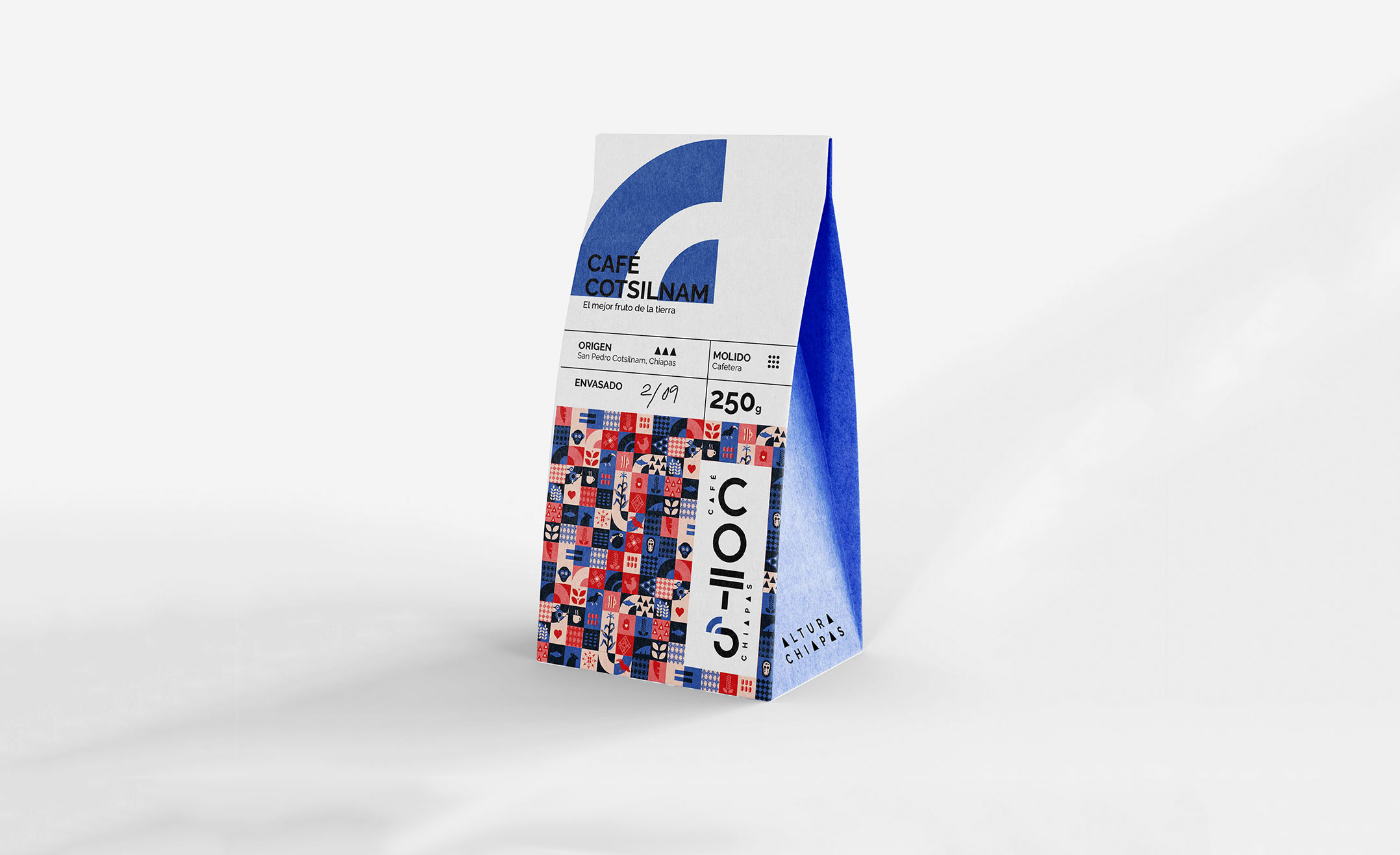
Logo and packaging redesign work for coffee brand
Café Cots is a coffee brand located in San Cristobal de las Casas that roasts, brews and markets organic coffee varieties from different communities and small producers in the state of Chiapas.
They need a logo redesign as well as a packaging design to start marketing the coffee.
The goal is to position origin coffee in the taste of the regional, national and international public, benefiting producers by marketing their coffee and enhancing its flavour through roasting and blending.
Redesign the logo and design recognisable packaging for each coffee blend.
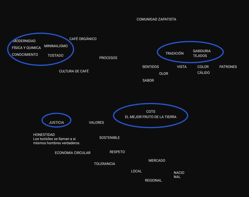
After a series of interviews and co-creation sessions, we came to the conclusion that Café Cots is ORGANIC but PROCESSED, it is a roasted coffee where technology and culture enhance the natural flavour of the coffee of origin.
Therefore the brand must breathe modernity, knowledge, tradition and origin. The shapes that can best represent these qualities are geometry supported by the symbolism and tradition of the land.
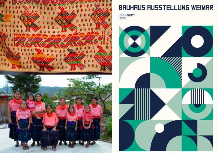
Tradition and origin are taken from Mexican symbology, textiles, colours and nature. The technology we borrowed from the Bauhaus.
Geometry That brings us closer to the concept of modernity and technology.
Symbology That brings us tradition, origin and culture.
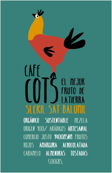
Label and original logo and evolution of graphics and illustrations